One small planet, drawn by hand.
How A Tiny Planet looks, sounds and shows up — for anyone designing, writing or printing on our behalf. A boutique marketing agency in Ho Chi Minh City helping finance, fintech and trading brands enter Vietnam.
Everything stays quiet so the planet can be the personality.
Warm, hand-made, human
The planet is drawn with visible dashes, not vectors. We are a people business, not a platform — never redraw it as a clean geometric icon.
Small but global
"Tiny" is the wink; the orbit is the reach. Layouts and copy feel personal and expert at the same time.
Clear over clever
Our clients sell complex financial products into a regulated market. Our own materials model the clarity we sell.
One artwork. Use it exactly as supplied.
The textured planet, its two orbit rings and the navy brush-script wordmark are a single piece. Never retype the wordmark, recolour the planet or separate the rings.
At least the height of the capital "A" on every side. 64px at hero size.
120px wide on screen, 30mm in print. Smaller than that: use the square mark.
Don't
The palette is the planet itself.
Navy ink plus a sunlit run of yellows and oranges, sampled from the logo artwork. Click a swatch to copy its hex.
Proportion
70% white surface · 20% Planet Navy · 10% warm accent. One warm colour leads per layout.
Contrast rules
- Body text is always Planet Navy (10.4:1 on white).
- Marigold is decorative on light grounds (2.1:1) — never body copy.
- Accent-coloured text uses Cinnamon #9A4A14 (6.2:1).
- Text on any warm fill is navy. Never white on marigold.
Fraunces for titles. Plus Jakarta Sans for every other word. Billock for a signature.
A soft, warm serif that echoes the hand-drawn planet. Display, H1, H2 and H3 only, at weight 600. Free on Google Fonts, full Vietnamese diacritics. Never for body copy, buttons or labels.
Đưa thương hiệu tài chính vào Việt Nam — rõ ràng và tự tin.
Brand text typeface, replacing Euclid Circular A everywhere. Free on Google Fonts, weights 200–800, full Vietnamese diacritics.
Thị trường Việt Nam, rõ ràng hơn. Đối tác chiến lược cho thương hiệu tài chính.
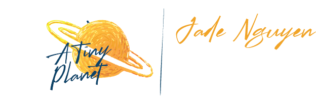
Signature script. Only for a person's name on stationery, in Marigold, once per layout. Latin only — it has no Vietnamese diacritics, so never use it for headlines or Vietnamese text.
Fraunces · 64 / 68 · 600
Fraunces · 40 / 48 · 600
Fraunces · 28 / 36 · 600
Fraunces · 20 / 28 · 600
Jakarta · 13 / 16 · 800 · caps
Jakarta · 18 / 26 · 500
Jakarta · 16 / 26 · 400
Jakarta · 16 / 26 · 300
Personal, expert, plain-spoken.
- Speak as "we", to "you". Short sentences, concrete outcomes.
- Write in English or Vietnamese — one language per sentence.
- Always write Vietnamese with full diacritics: "Thị trường Việt Nam".
- Use fintech and investment language.
- Write the name as A Tiny Planet; A TINY PLANET only in the eyebrow line.
- Use hype words, emoji or exclamation-mark marketing.
- Write unaccented Vietnamese ("Thi truong Viet Nam").
- Make regulatory or performance claims on a client's behalf.
- Abbreviate to "ATP" in anything a customer sees.
- Use bull/bear or candlestick-wall trading clichés.
"We help international finance and trading brands find their footing in Vietnam — with strategy, localisation and the local team to run it."
Round like the planet, calm like the page.
Buttons
Primary: marigold fill, navy text. Secondary: navy outline. One primary per view. Focus: 2px navy ring, 2px offset.
Tags
One accent tag per group; the rest soft cream.
Spacing & radius
4-point steps. Square for print · 6 tags · 12 cards · pill buttons.
Name cards and signatures.
55 × 85 mm portrait cards: the logo on the front, the planet bleeding off the back with the Billock name, contacts in navy and a marigold base bar. Reprints swap Euclid Circular A for Plus Jakarta Sans — the layout stays.